
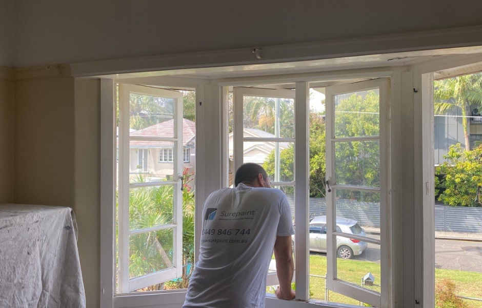
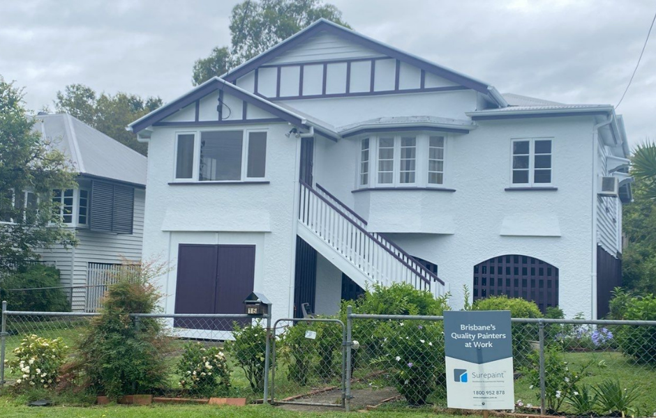
Best Whites To Paint Your Home
The only white scheme guide you will ever need
Get a Free Quote
Fill out the form below we'll be in touch shortly to review your property and scope of work.
- Your privacy is secured. We do not share your information with third parties.
Best Whites To Paint Your Home
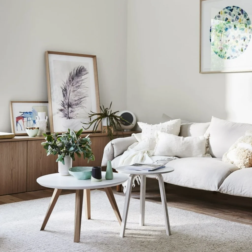
If you have ever tried to choose white paint colours, you will agree that choosing white colours are probably the hardest! There are just so many types of shades and tones, it ends up giving you a headache and just feels like an endless rabbit hole.
No two whites are ever the same when you start comparing the tones and shades. When it comes to residential painting, understanding the difference between the types of whites will make your colour journey SO much easier once you understand what the colours do to the look and feel of the space.
So, in this guide I am going to show you the best 9 whites you should consider to use to paint the interior or exterior of your home. And in order to get rid of the overwhelming feeling, I’m going to give you a fool proof way of looking at how to choose paint colours.
2 Types Of White: WARM Whites VS COOL Whites

Warm whites and cool whites are very different from one another and go in completely different directions.
These different directions will change the look and feel of the space, so understanding which side of the white you are going to use is really important. Certain items go with certain colours, it’s just a fact of interior design.
You cannot have sleek marble floors with cream yellow walls!
Not only do the white tones you choose play a big part of your overall style but also the fixtures and fittings the house has will also impact the look of the space.
It’s also important to take into consideration the style or architecture of the home, dressing something up and turning into something that its not is two completely different things.
Understanding The Colour Direction
All paint colours start off as untinted white.
Untinted white means that no colour has been added to the paint, its basically pure white. Depending on which direction of colour choice you are choosing such as warm whites or cool whites, different tints ( colours ) are applied to the pure white to change the colour. Now this is where choosing colours comes to a cross road which also makes life easier…
So before we can add any colour to the Pure White paint, we need to decide what we will add;
- Blacks or blues, or;
- Yellows, browns or umbers
Blacks and blues make cool colours; yellows, browns and umbers make warm colours. It’s your job to choose which look and which end of the spectrum you are going to be on.
Cool Whites
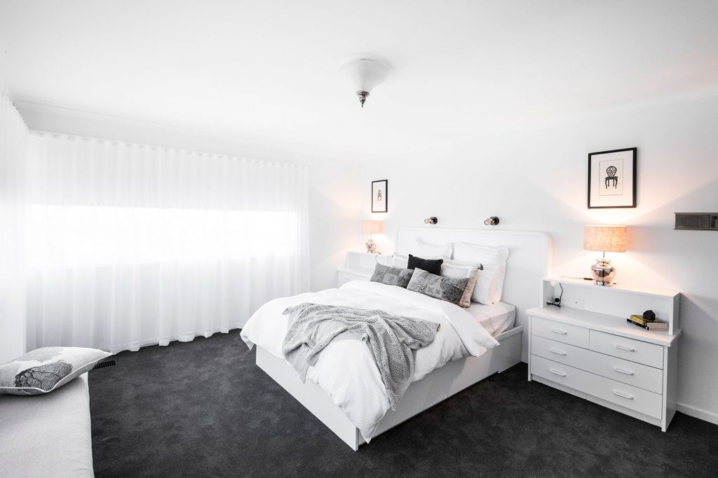
The cool tone of whites has more black and blue tints incorporated into them. It starts out to be 1 or 2 drops of black or blue which makes the cool tone. As more is added, it turns from white to blue or grey tones. This look leads more towards modern and crisp looks which work very well with the following items;
- Black or dark colour thick pile carpets
- Marble or stone floors & bench tops
- Light Beech timber furniture with dark tones for cushions and coverings
- Modern fixtures such as lights, switches, doors etc
- Stainless steel, exposed metals
The above things can still work on older style of homes. However, what you will generally find is that the home has been renovated and completely upgraded with all the above items which makes the cool colour tones work. The cool whites are merely a canvas for the other fixtures to work around and because the cool white tone complements the darker grey / black tones it tends to look really modern and expensive.
Key Tips When Using Cool Whites
- All ceilings, walls & trims should be the same colour
- Use lower sheen levels to make better impressions such as satin on trims, and matt on walls as it will defuse the light and have an elegant “matt” look
- Use grey tones on flooring as blacks tend to be too heavy in large spaces
- Ensure your painter uses an Aqua enamel over a regular oil based enamel as all the trim items will evenly turn yellow over time and wreck your colour scheme.
Thinking Of Just Getting Someone Else To Sort It All For You?
At Surepaint our team can not only take the stress out of painting but also help with design you the perfect grey colour schemes.
Warm Whites
Warm whites start in the same way as cool whites, basic untinted white. From there, yellows, umbers and brown tones are added to create a warmer white. If too much yellow or umber is added, you will end up with a cream of some sort; same applies to browns and beiges.
So this look of warm whites leads more towards two different trends
- Full Colonial Style
- Modern Yet Inviting Style
Colonial Style
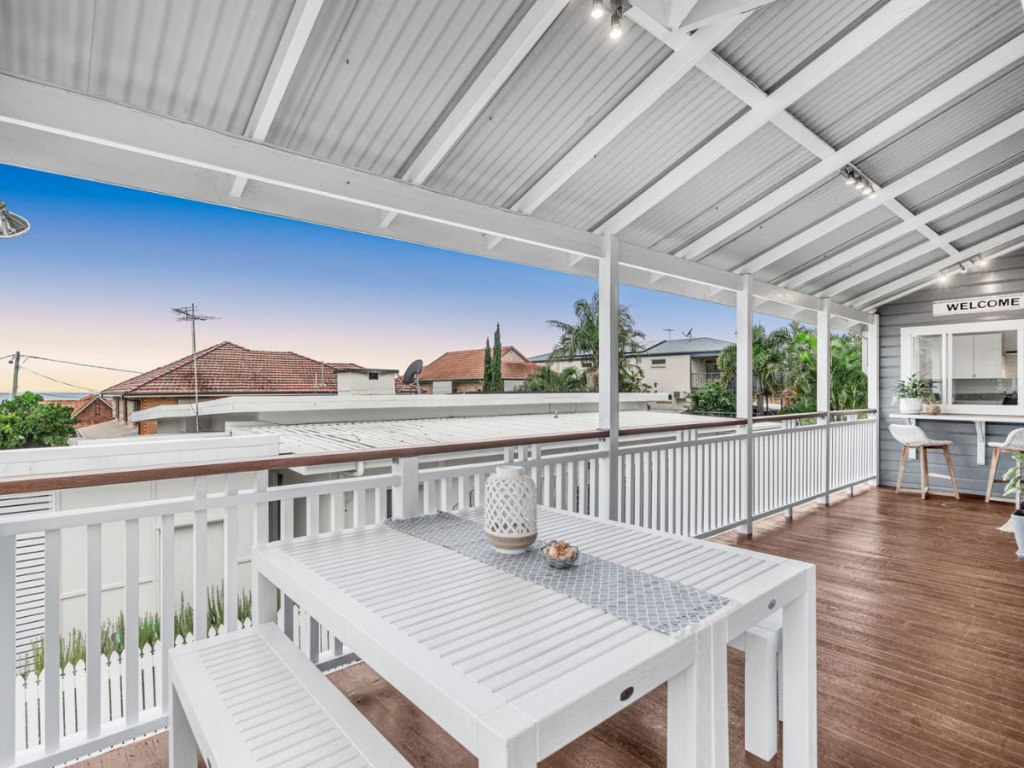
Colonial style is limited to a very unique style of home. These homes typically have very unique features such as original timber floors (not laminated), claw feet baths, high ceilings, chair rails etc. It’s because of these unique features, the Colonial style warm creamy whites work very well, as they work around the natural profiles along with tying into the natural dark tones of the floor boards and heritage types reds and greens tones.
These warm whites tend to be a lot more creamy and have more earthy tones which are very unique to this particular style of house.
These styles of homes typically have VJ boards, large colonial skirting boards, fret work and chair rails.
With this style of home the warmer tones can be broken up with various whites to the trims so the colour palette looks more balanced.
Its also important to consider most of these style of homes have high ceilings so when coupled with bright whites for trims and ceilings the areas can be flooded with light which doesn’t make the space feel cramped, dark and beige!
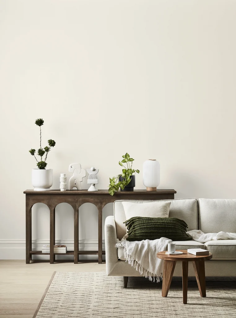
Modern Yet Inviting Style
This style is a blend of lower tone warm whites, meaning very little yellow, browns and umbers. These tones vary quite a bit. However, it tends to feel more homely and inviting with an array of current fixtures and fittings. This style tends to allow the home owner to work with a lot of their current furniture and fixtures to create a space that is neutral and warm yet still modern which will increase the liveability and value of the home by not polarising the style.
Unlike cool whites, it’s best the have multiple colours in your colour scheme to break up the darkness of the wall colour. Use lower warm tones than the wall colour to brighten up the space and create a pop between walls, trims, and ceilings.
Key Tips When Using Warm Whites
- Earthy tones on floor coverings are key to balance out wall colour
- Lower warm white tones work best for more modern style homes
- If the home has unique colonial fixtures and you are not completely renovating, a brighter tone colour approach will benefit the home’s current fixtures
- Lower warm tones work with all furniture types
- Break up the warmness of large wall spaces with lower warm tones
- As the warm tones move into a colonial, homely feel. Various elements such as the amount of natural light your home receives and the colours of the flooring, furniture and blinds will affect the shade and depth of the white colour chosen.
5 Of The Best Warm Whites To Paint Your Interior!
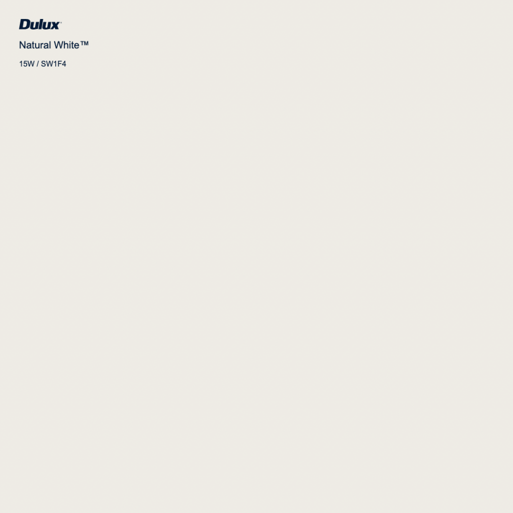
Dulux Natural White
Natural White is a warm white and its versatility spans across new and old properties, contemporary homes, as well as traditional. It is an excellent choice if you are giving your home a facelift before sale as it is easy to work with when styling with fresh plants and light coloured furniture
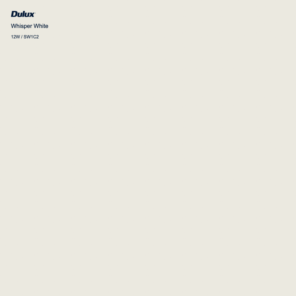
Dulux Whisper White
Whisper White is warm, welcoming and has substance, and period properties – Victorian and Edwardian homes – benefit from this white given its depth. In a space that doesn’t get much bright sunlight, Dulux Whisper White can really lift the room.
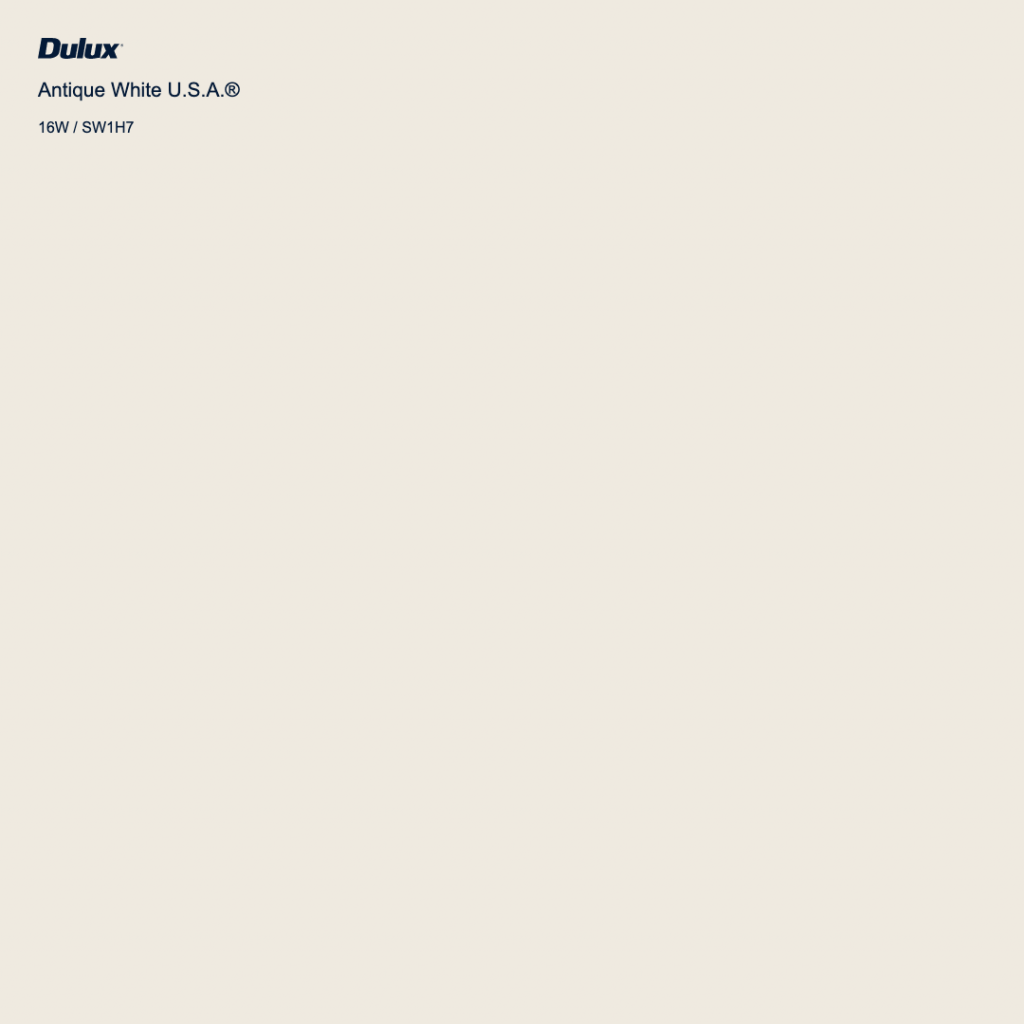
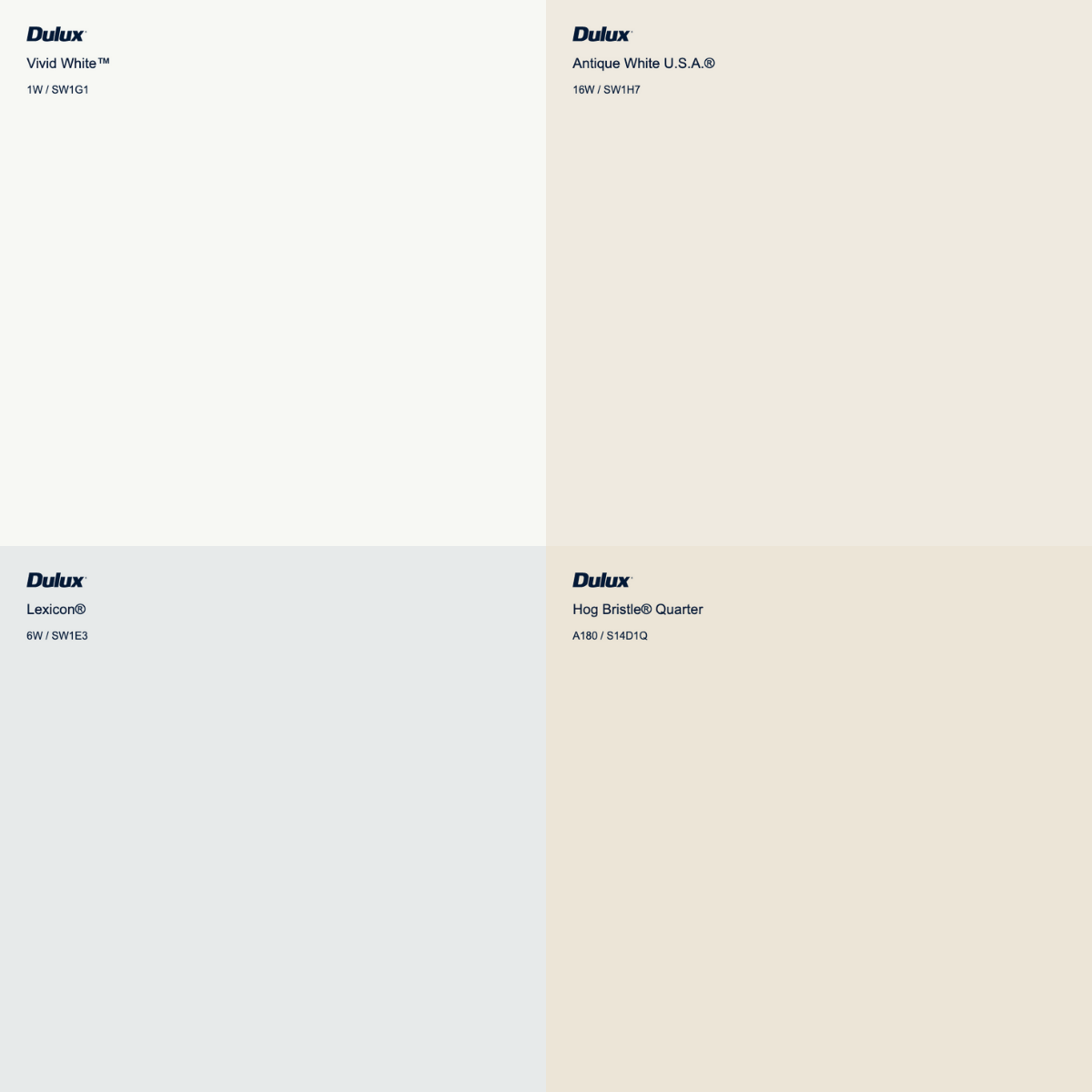
Dulux Antique White USA
Antique White U.S.A. is a hero of all whites as it is fresh and crisp without being clinical, and tends to work in most spaces despite varied conditions. A total all-rounder that never disappoints. Given its warmth with homely tones Dulux natural white works really well with natural stones without the space feeling like a hospital.
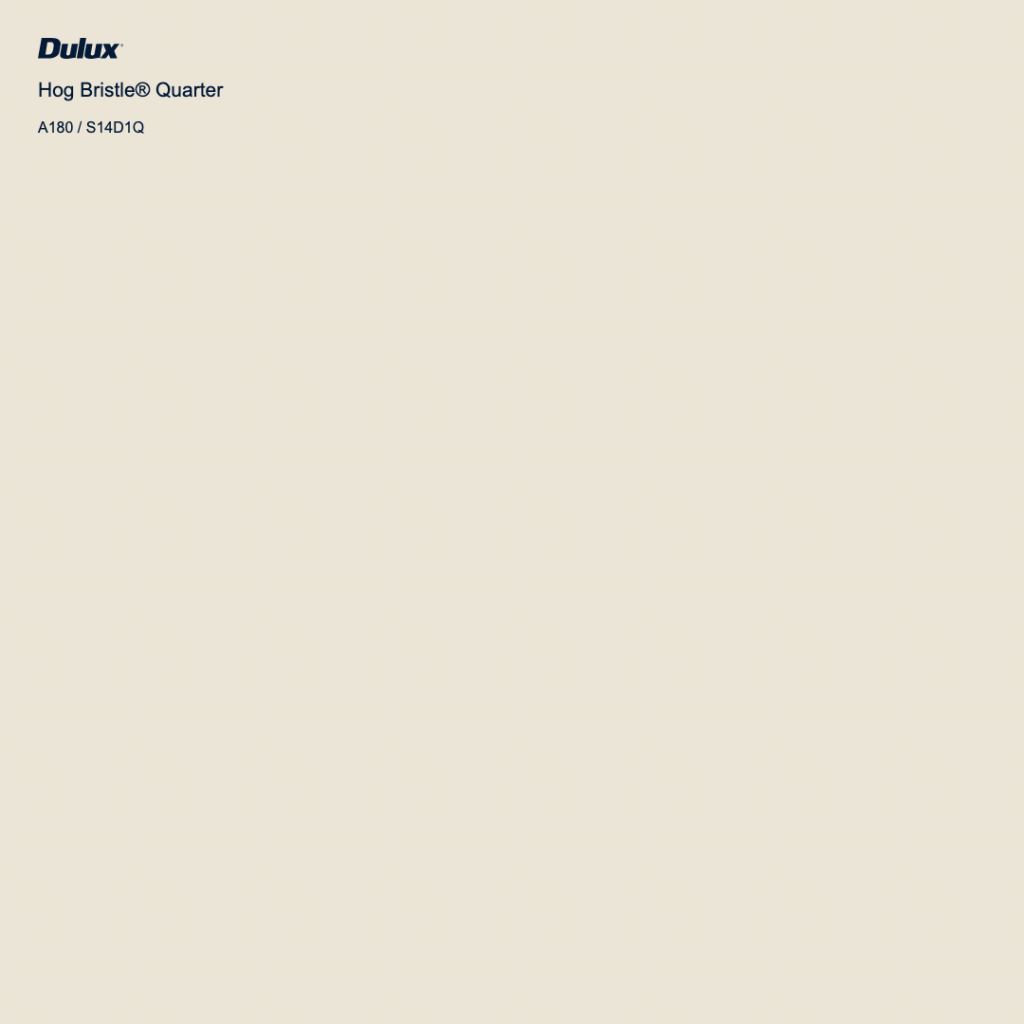
Dulux Hog Bristle Quarter
Hog Bristle Quarter is a beautiful warm white that has the slightest ‘biscuit’ undertone – it has always been our go to colour when creating warm cozy spaces. This colour work beautifully well in Queenslander style homes with VJ panels and heigh ceilings. This colour also works really well with accent trims in a lighter warm white to make the trims & doors pop out from the walls.
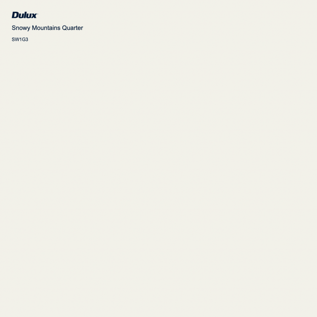
Dulux Snowy Mountains Half
Snowy mountains quarter works extremely well on ceilings, doors and trims. It has a very warm yet white tone which isn’t too ‘clinical’ like when using a cool white.
Snowy Mountains Quarter works fantastic on its own to brighten up a space yet still makes it feel warm and homely but without the “cream” or “brown” tones.
4 Of The Best Cool Whites To Paint Your Interior!

Dulux Vivid White
If you are looking for absolute pure white, then Dulux vivid white is the colour for you. This white is pure white without any blues, blacks, yellows, umbers or brown tints added. It is great for brightening up darker areas where you need the light to really reflect.
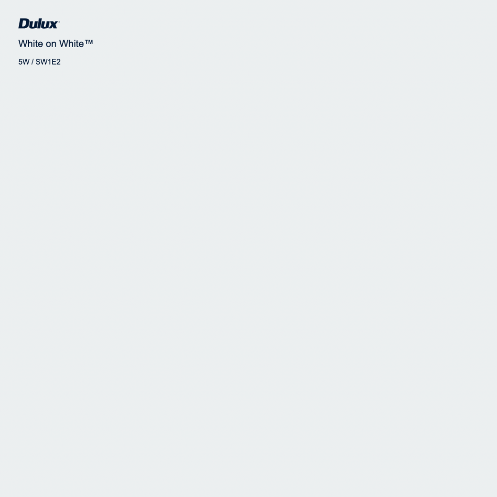
Dulux White On White
White on White™ is a cooler-toned white that is clean and energising, suited to modern homes with timber or concrete flooring, as well as hard surface areas like the kitchen and bathroom. It has a touch of bluey grey and is a cooler toned white that isn’t as polarising and clinical as the lexicons and vivid whites.
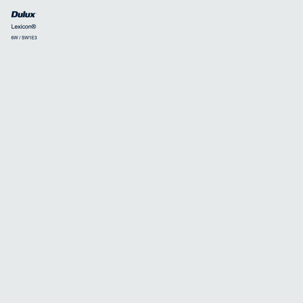
Dulux Lexicon
“Lexicon® is a bold white and pairs brilliantly with timber flooring, exposed brick and polished concrete. It is a perfect shade for displaying your artwork collection or bouncing around lots of natural sunlight.”
Dulux Lexicon Quarter
“Lexicon® Quarter is a versatile white that has a slightly blueish undertone – it is crisp, clean and bright and works beautifully in modern spaces, as well as a backdrop for colourful and eclectic art, furnishings and homewares.”
We Help You Choose The Perfect
Colour Scheme
By working with Surepaint, our team of skilled professionals can help you choose the perfect colour scheme for your property.
You can have total peace of mind with our unique colour selection process by taking advantage of our colour consultants and digital overlay process.
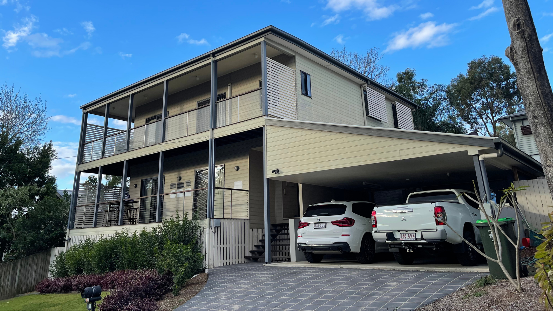
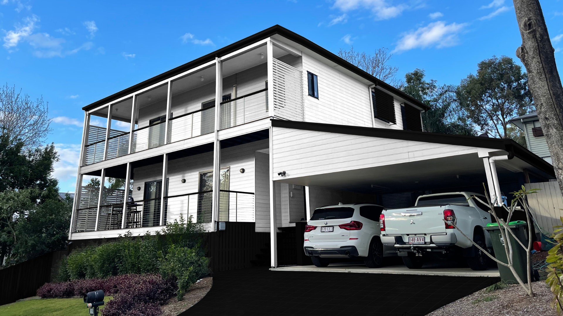
Take a look at the below digital overlay we did for a client. This is not a finished product but rather a digital rendering of her colour choices.
Why use Surepaint™?
Learn about how we accommodate all different types of projects and customers with our unique painting approach

10 Year Warranty

Competitive Pricing

Honest Policy

Our Promise

Our Quality Guarantee

Our Promise
Surepaint™ is committed to providing our customers with the finest attention to detail, our utmost professionalism, and a truly personalized experience ensuring we deliver on our promises no matter how big or how small your project.

Our Quality Guarantee
We adhere to the highest residential and commercial painting practices and standards in Australia. Our quality commitment reflects in the selection of our products, our unmatched skill, and our incredible expertise in addressing your project repair needs.

10 Year Warranty
Our exclusive 10-year warranty speaks volumes about the confidence we have in the quality of our paint and our workmanship. Our customers are provided peace of mind their paint job undertaken by us will be covered by our quality commitment. From the correct planning to preparation. Your newly applied paint will not peel, flake or blister for 10 years. This we guarantee.

Competitive Pricing
Affordable paintwork that does not compromise on value is what we at Surepaint™. are about. Our competitive pricing has contributed to our reliability and exceptional paint service. We will provide an accurate and transparent quotation based on the best industry prices!

Honest Policy
We value honesty. At Surepaint™, our customers can depend on our honest and authentic approach from the moment you contact us for an estimate to the completion of your paintwork. Our clear approach has allowed us to develop long-standing professional relationships with many of our customers
Reviews
We have over 100 Google Reviews & Over 30 Facebook Reviews
